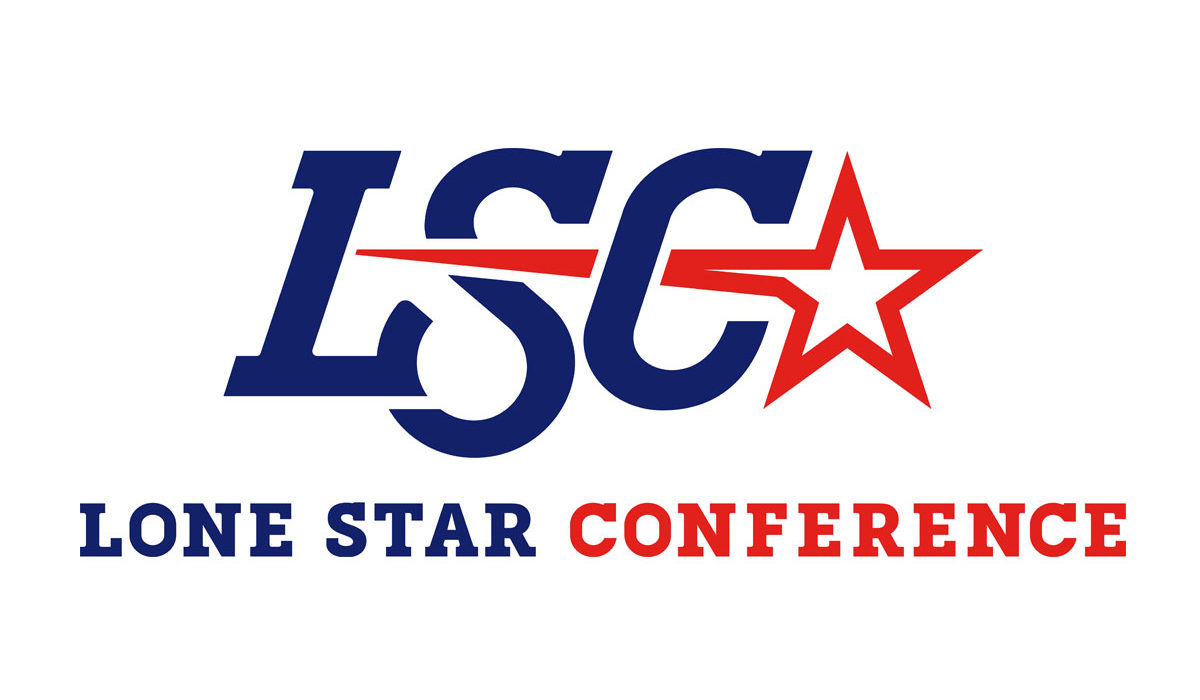
LSC launches refreshed brand identity
LSC Communications
RICHARDSON, Texas – The Lone Star Conference unveiled a refreshed brand identity on Tuesday in partnership with Torch Creative. The new look is designed to modernize and unify the conference’s brand and marks the first logo update since 2009.
The conference’s historic expansion to become the largest NCAA Division II conference at 19 members provided the opportunity for the conference to evaluate and update the conference look.
“We are very pleased to share the new look for the Lone Star Conference as we move forward into a new era as the largest conference in NCAA Division II,” said LSC Commissioner Jay Poerner. “The refreshed logo provides our conference a new more dynamic look as we continue to build upon our storied history of academic and athletic success.”
The updated look features the traditional LSC and “star” acknowledging the incredible history of the conference while modernizing the brand with a new more advanced typeface and a darker and stronger shade of blue.
The conference logo will now be available in institutional colors for each of the league’s 19 members providing a unified brand identity across the LSC. Institutional color logos will available for multiple applications including jersey patches, facilities and digital platforms (websites, social media and live-stream broadcasts).
Additionally, the LSC will have a new championship logo as part of the refreshed brand that will further enhance the new look of the league.

